
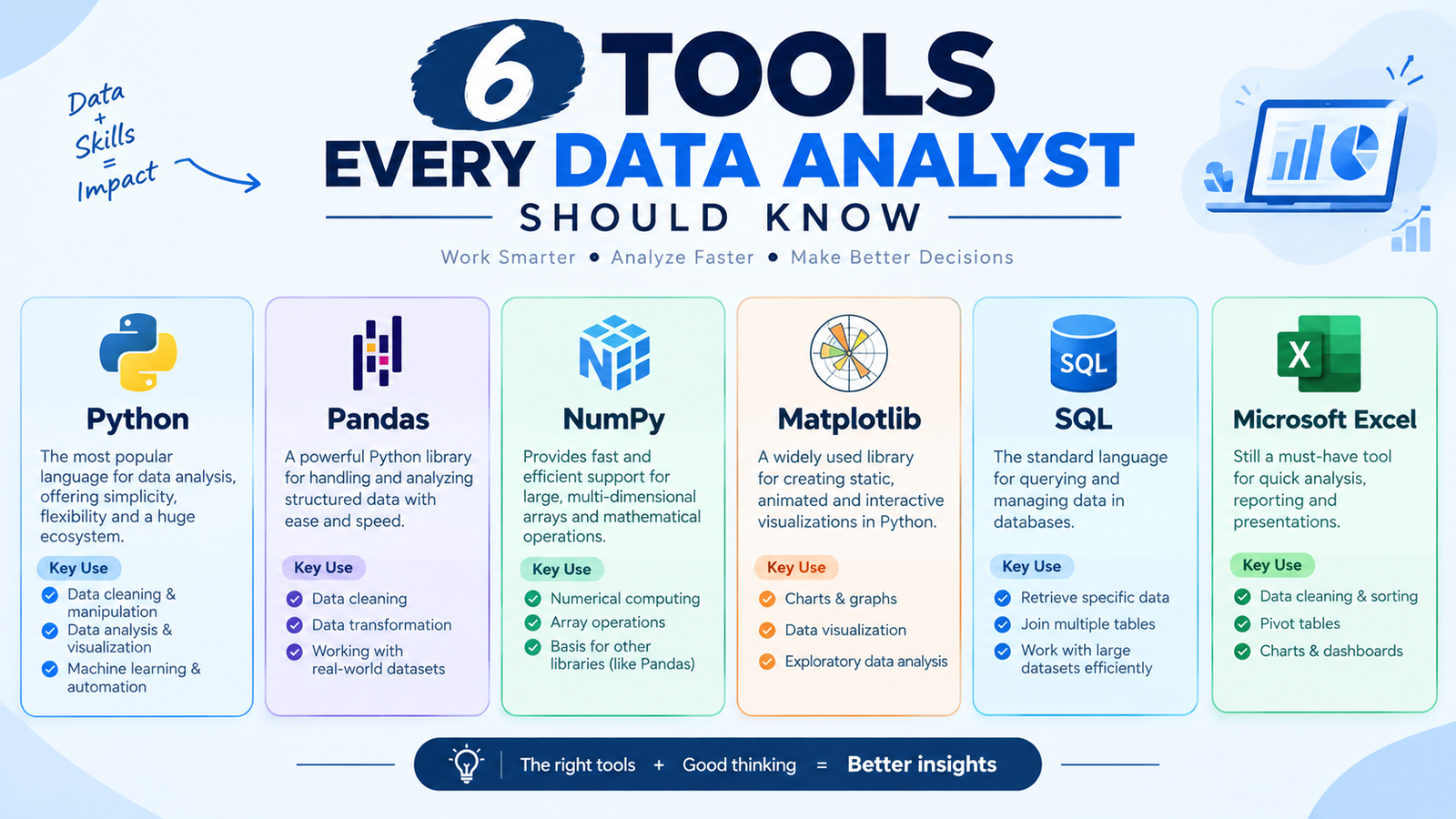

The field seems impossible to investigate from the outside, as job posts for data analysts call for 20 different tools. The reality is that it’s a very slim stack being used for daily work. These 6 are learned properly and you will be able to get through any analyst position, regardless of the industry. These are the ones you should learn in the order you should!
1. EXCEL
Anybody wants to avoid excel and dive straight into python. Do not. Most business information is still stored in Excel, and most managers want to see it in Excel. Get a correct understanding of pivot tables, XLOOKUP, and conditional formatting. Just keep in mind the ceiling of it: a sheet stops at 1,048,576 rows and begins crawling long before that. After learning more powerful tools, many analyst interviews still involve a live Excel test, so this is a valuable skill that will never go to waste.
2. SQL
To get the best out of this list, learn SQL. It’s the top skill that people ask about in analyst interviews, and we don’t blame them. The real data that your company utilizes isn’t in a folder of files, but rather in a database. SELECT, JOIN, GROUP BY and WHERE enable you to extract exactly what you want from millions of rows in seconds. Work with a free sample database until you get comfortable with joins. One good query can save an hour of filtering, copying and pasting.
3. PYTHON WITH PANDAS
If you manually enter data to Excel each month, it is work that you’ll continue to do forever. Python fixes that. The Pandas library allows you to write the steps you want to take for cleaning once and then run the same script next month with a single click. It also can open files that excel cannot open and it integrates well with API’s and databases. Here, you are not required to be a whiz with programming as the basics are repeated in almost every project you work on.
4. POWER BI OR TABLEAU
Nobody wants to read your spreadsheet! They want one screen to display only the numbers that are important. Power BI and Tableau directly access your data source and automatically refresh dashboards. Both have free desktop versions to practise on. Choose one and explore the idea in detail, as the idea can be transferred to the other. A good dashboard eliminates half the questions you get asked in the office every day.
5. BASIC STATISTICS
This is not software, but without that the other tools are hazardous. You should be able to recognize when to use the average and when to use the median, and when you can trust a sample and when you can’t, and that there is a difference between correlation and causation. If not, you’ll come across as confident with a chart that tells you nothing, or one number in a meeting and you’ve got your credibility ruined for months. The report is about the difference between statistics and analysis.
6. PRESENTING THE NUMBERS
The final one is the tool that no job posting would include. If your manager doesn’t understand your analysis, then it’s a waste of time. State the answer, then a chart back it up, and only one message per slide. Did you know? The explanation of his work is what attracts him to decision meetings and that is where his career really takes off. Don’t have a lot of technical detail as part of the conversation, have it in an appendix.